
They put up this advertisement a few months ago, and I wanted to post all the time how bad it is.
Today I’ll tell you why it is good.
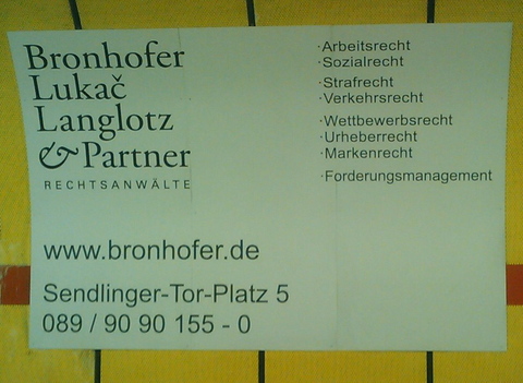
Obviously, you will notice the typography, an aggressive mix of a rather nice corporate identity and Arial that just jumps into your face, and makes you want to rip your wet, crying eyes out, and throw them on the railway line.
Furthermore, note the spacing: the asymmetry, the wasted space, the alignment of text chunks to the corners. The intimacy the bullet dots have with their list items.
This tension of uglyness is the key. It makes you look at the ad everytime you wait for the train. It targets the people who see the ad regularily: You look at it everyday, you cannot ignore it. Anyway, they wouldn’t attract one-time visitors of the ad.
Imagine the ad was beautiful. You’d look at it once, and then it would just fade away. They are laywers, and they do boring stuff. They can’t put attractive women/nice landscapes/shiny things on it to make you look at it more often.
I think it works. It’s really subtle.