| January 1998 compulsion by leslie harpold |
|||||||||||||||||||||||||||||||||
|
You Don't Eat Them
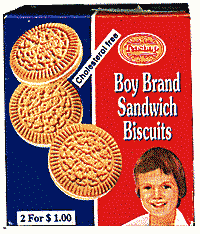
Confess: You have a friend who's a horrible liar, or completely unreliable, or an ex who was dreadful to you but you still had that fatal attraction to? Yet in spite their flaws, you love them anyway. So, it is in the spirit of loving disappointment i introduce you to Boy Brand cookies.
Forget the cookies. Literally, erase from memory the fact that the reason you give the cashier fifty cents for the privilege of walking out of the store with this package is that it contains a food item. The vanilla sandwich cremes taste quite literally like cardboard. The cookie outsides are utterly tasteless and the white frosting is hard and devoid of any nuance of flavor at all. I tried to eat a second one to see if it got any better, but after two, I abandoned my research completely. my initial instincts has been correct, it wasn't about a snack food. It's about packaging. Big companies like General Foods and Nabisco spend tens of thousands of dollars finessing packaging for their cookies. Several versions are designed, focus grouped and revised. Mock ups of the store shelf are constructed to assess how the packages will stand out amongst the other available choices in the cookie aisle. Incredible amounts of energy and resources are given to naming the product something cute, memorable and catchy that will sound good in jingles and be easy for the kids to remember.
It is with some certainty I assert that this was not the case for Boy brand cookies. The red and blue package is distinctive, the low grade, off register printing, bad paste up and nearly unreadable type finesse the experience. What gets me is the "Boy" on the package though. Close inspection of the printing leads me to believe that a picture was cut from a magazine and sent to the printer for seps. The clear photo realistic cookies on the box front are a whole other grade of art from the dotty, off color human image it shares real estate with.The way his shoulder slopes unnaturally leads me to believe that not only was he sliced from a magazine photo - but that photo also contained other people as well, which explains the unnatural angle of truncation his shoulder has received. It seems that the Boy in Boy Brand cookies also cuts his own hair - his bangs run rough shod over his forehead in a Warhol-like interpretation of an appropriate children's 'do. Unless this is - and I would love this too much for it to be true, a kind of homage to Warhol, referential packaging referencing the art that is - wait, who am I kidding? Teashop, the manufacturer has taken all this time and energy to bring us these cookies straight outta Yemen, so I'm guessing the red white and blue and vaguely westernized child are - like the Mentos ads, designed for universal export. So no matter where the cookies are sold, the consumers will feel they are "for them". There's no other way to say it, this package is deliciously awful, and likely far tastier than the cookies if eaten. Which is fine because I just love looking at it.
in the junk drawer:
December 1997
|
|